"Is My Law Firm Website Sabotaging Me?" Common Design Mistakes That Drive Away Potential Clients
"Is My Law Firm Website Sabotaging Me?" Common Design Mistakes That Drive Away Potential Clients
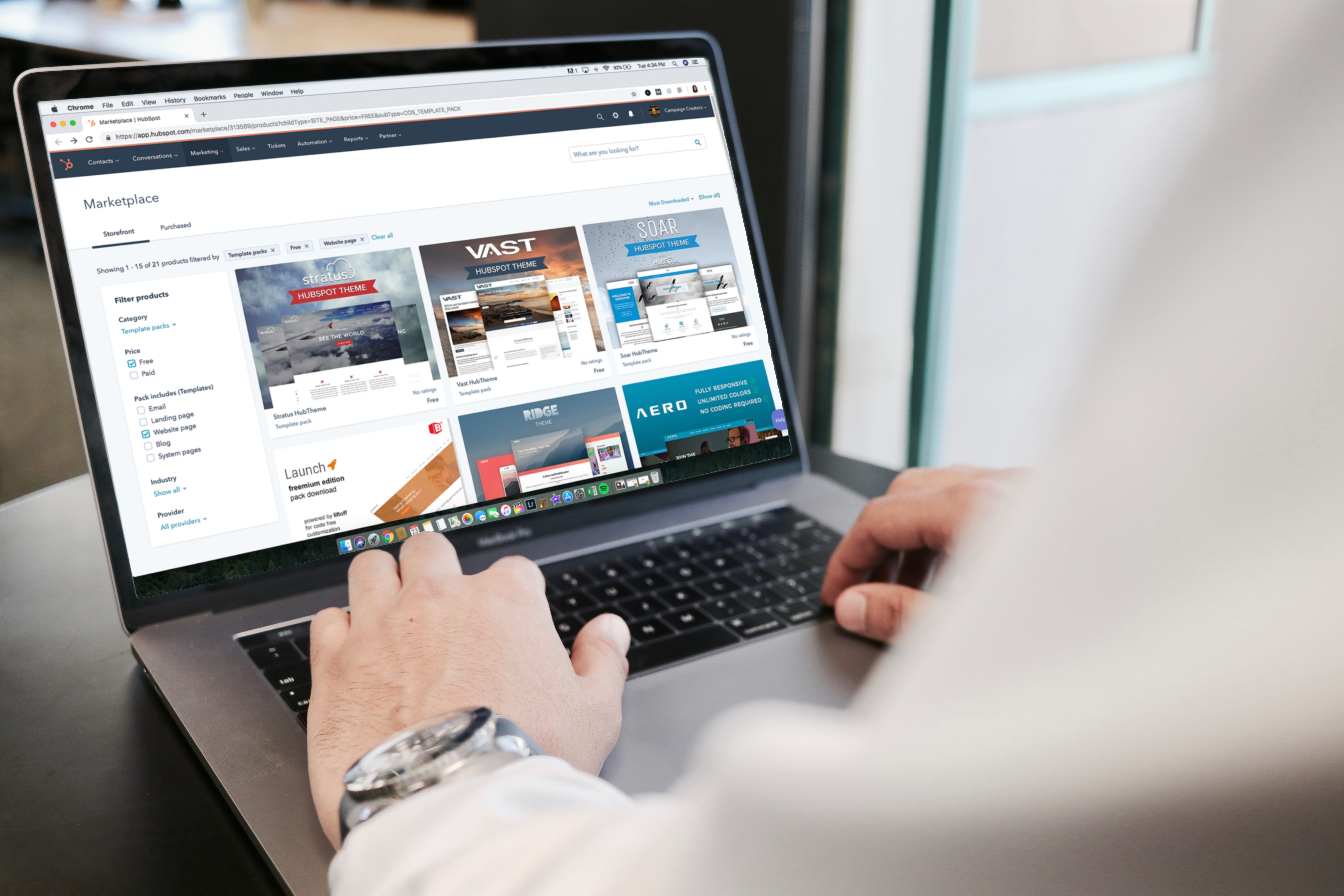
You've invested countless hours building your reputation as a skilled and knowledgeable attorney. You meticulously prepare for every case, your courtroom arguments are sharp, and clients appreciate your dedication. But there's a hidden factor that could be sabotaging your growth: your website.Imagine you're a potential client in need of urgent legal help, and you're actively searching online for "how to get worker compensation leads". You stumble upon your firm's website, but it's a confusing maze of outdated graphics and unclickable phone numbers. Frustrated, you assume if you can't be bothered to update your website, you'll be equally behind the times in your legal approach. With a click, you're on to your competitor's sleek and easy-to-navigate site.It's a harsh truth: even visually appealing websites can contain functional flaws that drive away business. Potential clients don't care about elegant design elements if they can't immediately figure out if you offer the services they need and how to get in touch. Understanding these common pitfalls empowers you to ensure your website is a powerful asset, not a hidden liability.Navigation That Leaves Them LostThink of your website's navigation as the roadmap for potential clients. If that map is confusing, filled with dead ends, or sends them in circles, chances are they'll simply abandon the journey and seek a smoother route offered by your competitors. Dropdown menus can be helpful, but when they contain too many options or those options are vaguely labeled, they create friction rather than efficiency. Crucial pages like your practice areas and an easy-to-find "Contact Us" section should never be hidden several layers deep within a convoluted menu structure.If your website has a robust blog or resource section, a simple search bar is essential. Potential clients may arrive with a specific question in mind. Enabling them to quickly search and find the precise information they seek increases engagement and positions you as a knowledgeable authority.Never fall into the trap of "Well, it works fine on my computer!" How a website renders can vary greatly between different devices, browsers, and screen sizes. What appears perfectly spaced on your desktop might be a jumbled mess of overlapping text and broken links on a smartphone. Thorough testing across a range of platforms is crucial to ensure a positive user experience, regardless of how someone is accessing your site.Where's the 'What Now?' - Lack of Clear CTAsYour website might be filled with informative content and establish you as an expert in your field. But if it lacks clear calls to action (CTAs), you're leaving potential clients hanging. Passive language like "Learn More" does little to inspire action. Be direct! "Schedule Your Free Consultation Today", "Download Our Guide to [Legal Issue]", or "Get Your Case Evaluation Now" convey a sense of urgency and offer tangible value to the visitor.The placement of your CTAs is just as important as the wording itself. Ensure there's a prominent one "above the fold" – meaning a visitor doesn't have to scroll to see it. CTAs shouldn't be relegated solely to a separate "Contact" page. Integrate them throughout your site, after blog posts, on service pages, and even within sidebar content. Make it effortless for someone to take the next step the moment they're ready.Resist the urge to offer too many choices. While you may provide a range of legal services, each page of your site should have a single, focused CTA. Asking them to choose between scheduling a consultation, downloading a resource, or subscribing to a newsletter all at once creates decision paralysis. Guide them down a clear path, making the conversion process feel natural rather than overwhelming.The Frustration of FormsContact forms are a necessary part of most law firm websites. However, poorly designed forms become a major point of friction in the conversion process. Ensuring your forms are mobile-friendly is no longer optional. A significant amount of web traffic occurs on smartphones. If your form has tiny fields, finicky dropdowns that are hard to tap, or requires excessive scrolling on smaller screens, potential clients will abandon it in frustration.When designing intake forms, prioritize gathering only the essential information initially. Lengthy forms with intrusive questions can feel invasive, making visitors far less likely to complete them. Start with the basics: name, contact method, and a brief description of their legal issue. Once you've established contact, you can gather additional details.If you invest some of your time and learn more about PPC for law firms (pay-per-click) advertising, it will become obvious that a disconnect between your ads and landing pages is a costly mistake. Every ad should drive traffic to a specific page tailored to that ad's promise. For example, an ad focused on workers' compensation cases should NOT send people to your firm's general homepage. Ensure the landing page reinforces the ad's messaging, offering an immediate way to take the next step relevant to what brought them to your site in the first place.Your Expertise is InvisibleA potential client lands on your website. They're stressed, seeking help with a complex legal issue. Yet, your site's design makes it difficult to immediately determine if you even handle their type of case. Contact information should not be a scavenger hunt! Your phone number and a simple contact form need to be prominently displayed on every single page.While demonstrating knowledge of the law is important, your practice area pages should avoid being overly focused on lawyer-centric terminology. Potential clients want to know how you can solve their problems. Shift the language to highlight the pain points they're experiencing. Instead of a lengthy explanation of a legal process, emphasize the positive outcomes you've secured for others in similar situations.Social proof is incredibly powerful. Even with limited space, incorporate a few impactful testimonial snippets on relevant pages. This shows potential clients that you've successfully helped people just like them. Include a clear link to a dedicated page where visitors can find more in-depth reviews, building further trust and establishing your firm as the clear solution to their legal challenges.Speed Kills Conversions
 Close-up of car speedometer; image by Qimono, via Pixabay.com.

About Bilal Sajjad
Let me introduce myself, the editor of Beauty Lies Truth. I love traveling and visiting new places, and tend to bring comfort into the trip. I love spicy food, anything with lemon, nature, and I don't understand the point of taking a picture without one of us appearing in it.